Recently, Apple and Google have announced that they’re implementing Dark Mode into their new OS updates: iOS 13 & Android 10. Dark Mode is a theme for a digital interface that makes the background a darker color to reduce eyestrain and prolong battery life. However, implementing this new dark mode change into an app can create a blanket of issues. Not all design elements transition well into Dark Mode, and sometimes having an app run in dark mode invites a bunch of bugs and issues that weren’t present before. Even Google themselves aren’t offering Dark Mode for every one of their native apps, which may come as a surprise.
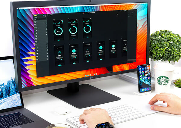
When it comes to websites, as long as they support CSS dark mode, they’ll automatically appear in their dark mode when its activated on the phone. When it comes to actual apps, it would be best to reference Apple’s native apps. They show a great visual representation of how well dark mode can look when implemented right. Designing a mobile app for Dark Mode can strengthen your skills as a UI Designer, as you’ll have to think of color schemes from the polar opposite spectrum of the color, how to make use of dark colors.
Usually when designing an app, it is common to veer away from using a color scheme focused on darker tones. It is easy to have those darker shades muddle together and mess up the composition of the screen design. However, being able to master this skill will prove rewarding in the near future as the two biggest mobile software companies have begun adopting the new trend of dark mode screens.
Adaptive Colors
One of the biggest design elements within Dark Mode is in it’s name: the darker color scheme. Dark mode makes use of the shades that grey and black offer. What makes or breaks a dark mode design is how the darker shades are utilized, and what other colors are paired with them. For example, if you were to use a dark, saturated purple on your already dark background, the contrast wouldn’t be high enough and the design would look bad and unprofessional. That’s why more muted and colorful options are the way to go.
You need to teach the colors how to adapt to the different screens they’re a part of. Make sure to specify the light and dark variants of a color you’re using, and avoid hard-coded colors or colors that don’t don’t adapt well. If your design looks great in Light Mode, but doesn’t translate well to Dark Mode, it should be a priority to adapt the design to look great on either mode. Ignoring Dark Mode can hold back your design capabilities. More and more software are adopting the use of Dark mode, and have that in your toolkit is sure to be a benefit in the near future.
Using Images
Some images that look great on your design might not look as good on Dark Mode. This is something you need to be prepared for as it can drag down a design if you don’t apply foresight to the images and graphics you use. A good practice for all UX Designers is to use photos and graphics you or your company owns or have created. This way you can change any colors or tweaks to make those elements work with dark mode. If you don’t have this option or just changing the colors doesn’t help, try using the hierarchy of dark mode to your advantage.
When in Dark Mode, the lighter tone elements appear to be above the darker tone elements. This makes them stand out from the background and adds depth to the design. It also helps avoid the biggest pitfall of dark mode design: Contrast and Legibility. Try to pair your images inside or with these lighter toned elements. This will help life the image off of the dark background and give it room to breathe. Image choice is also important. Pictures with a colorful, vibrant, and neon aesthetic look great on a Dark Mode design.
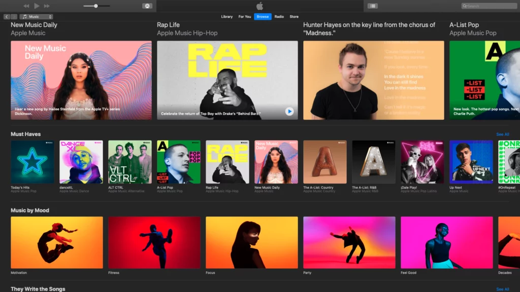
It is just like how in a city like Times Square, all of the billboard and ad screens use bright neon like colors to stand out int he darkness of the night. It creates a unique and memorable aesthetic that Times Square is famous for. Cities like Tokyo and Los Angeles also make use of this. You can implement this into your Dark Mode design and have your images create a unique and lasting impression they wouldn’t be able to convey on a lighter background. Apple offers SF Symbols, which are graphics that are already optimized to be used with light and dark modes.
Balancing Black
The most crucial part of designing for Dark Mode is in its name. All of the dark colors used in dark mode can become a problem if they’re not managed properly. When two dark colors are put together, there isn’t enough contrast for them to breathe in their own space. This causes the two colors to puddle together and not look visually appealing. It also causes pain for the user because they will have a hard time with differentiation of menus, screens, and text.
As a UI/UX designer this needs to be avoided at all costs, so learning how to properly balance darker shades is a lesson you can’t skip. However, something you also need to look out for is pure black. #000000 to be exact. Pure black is problematic for a number of reasons. Black is such a powerful color that it grabs hold of whatever screen its part off. In your design, just put a large black box in the upper corner of your graphic and you’ll see how it’ll throw the entire design off balance from its stark and demanding presence. Not to mention using pure black will add to eye strain to the user. If your app hurts your user’s app, it’s less likely to stay on their phone.
A good example of how pure black can affect a design are these two skeleton screens.
A screen with lighter shades of black as background compared to a screen with pure black a background.
One uses pure black as the background color, while the other uses it in visual elements such as shapes and menus. It’s clear to see that the screen using the black background looks much better than the one using pure black for other elements. Unlike traditional graphic design, using black is UX Design is very situational and needs to be used in a deliberate and appealing way. If you put pure black in your design without deep consideration, it can cause the app to be straining to look at and diminish the user experience. The easiest way is to keep pure black in the background of your mobile designs, or to keep it out of them completely.
Check ADA Compliance
Another crucial element to think of when designing for mobile is making sure it is ADA compliant. On January 15th, 2019 the Ninth Circuit courts issued one of the first appellate decisions on the subject of websites and mobile applications’ accessibility to visually impaired and other disabled individuals under the Americans with Disabilities Act (“ADA”) and similar state statutes. This has caused many websites, such as Beyonce’s official site, to be hit with lawsuits. It’s good practice to always design with ADA compliance in mind. Luckily Dark Mode makes it easy to make your app ADA legible due to the high contrast the darker colors can bring. Many sites have a high contrast mode for users with poor eyesight. This makes it easier for users to browse and go through a site.
Implementing elements from high contrast versions of sites into your dark mode design is a great way to stay ADA compliant as well as give your app a unique look. To accomplish this, you must reach a good level of contrast between text, visual elements, and the background. Using this Contrast Ratio Application created by Mari Johannessen, you can see the difference between a good contrast ratio and a bad contrast ratio.
Final Thoughts
The mobile app industry as a whole has begun adopting dark mode into their applications. Many smartphone users have their entire device set to dark mode by default! It’ll be important to add this skill to your design toolkit as you may run into a project where a good eye for dark mode design is needed.

