Keep your project on track with visual feature requirements.
designer sketching

If you’re a product designer in the field of making mobile applications, one of the goals for your projects is most likely to create a Product Map which allows you to view the entire application with all of it’s features organized from a bird’s eye view. But how is it made? By following the steps in this guide, we will explain the benefits of creating a product map and walk you through step-by-step on how to create one for your application.

Why Do We Need A Product Map?

When working on a Minimum Viable Product (MVP), the client, designers, and developers need a single source of truth to work from. The product map is needed to keep the project on track, show which features are being made, and show how a user will follow the intended flow of the product and use its main functionalities. When creating out the product map, there is no design. It is laid out with basic design shapes and text just to show where images, buttons, and input fields go. 

Unlike a feature requirements document, this format allows us to map out the connections between features and start thinking about the basic layouts of elements. With all that being said, a product map is not meant to replace a feature requirements document, but instead act as a supplement to it.

Below, we have an example we’ve made based on the mobile application TikTok to help a client see what they may or may not want in their application. Feel free to view our video on our Youtube Channel to see the whole thing! 

Here we see the features Authentication, Home, and Discovery/Search separated into their own columns

Creating Your Product Map

So where do we start when making a product map?

You’ll first want to create an outline for a feature requirements document that you’ll use as a reference point for your product map. This document should answer the following questions:

  • What are the expected features that will be included in your product?
  • What user types have been identified?
  • What are the minimum features needed for your MVP

Failure to do so will result in everyone misjudging the amount of time the project will take, set up unrealistic goals, and cause a lot of headaches moving forward. 

When creating the different screens of your MVP, having your screens follow the proper page number convention helps when referencing certain flows and screens and keeps the project organized. Each feature is assigned a number, and each page within that feature will begin with that number. For instance: Screen 3.0 Profile could represent the main view state of a user’s profile, while Screen 3.0a Profile edit represents the edit state of the profile screen. Any page that has multiple view states will be determined by a letter following the feature and view, as shown below. 

Now that you have a starting point and necessary information, you can start creating your product map. It’s helpful to begin with sketching out main screens on paper such as a dashboard screen, profile screen, etc. Choose the method you’re most comfortable with, whether it’s pen and paper or on your computer. Once you have a general idea of a flow, you’ll need a framework for adding screens and connections to your map.

Product Mapping A Feature

Separating each feature within its own column is an important way to see the full scope of how the user will flow through the feature. It covers different options the user can interact with, different states of activity, and is marked up to guide the viewer on where to go and where they should return to.

As an example to this guide, we will go through the creation of a simple authentication feature.

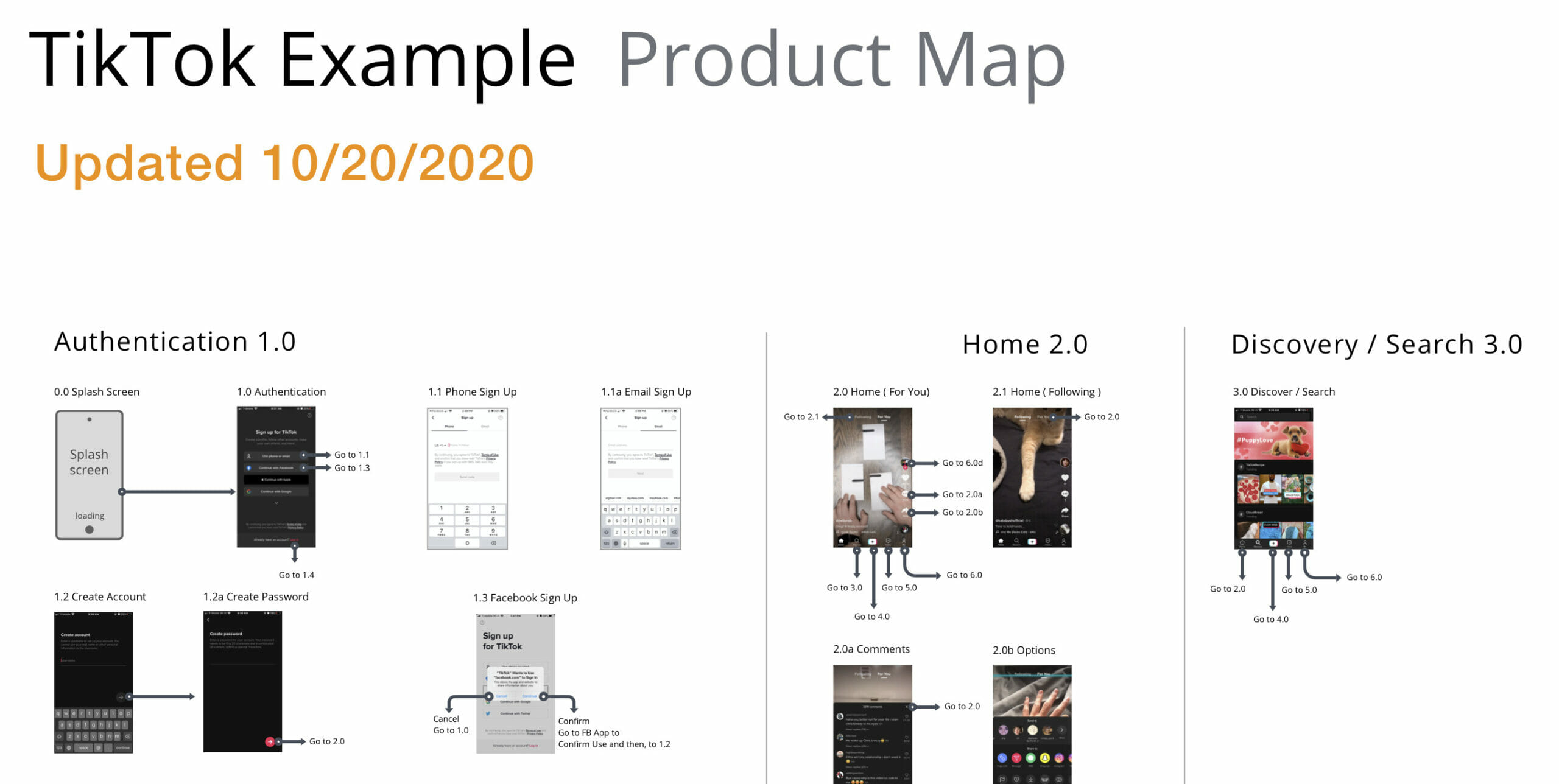
Feature: Authentication

0.0 Splash Page

    1. Write what’s inside it, i.e. a full bleed image, text, etc.
    2. Make an arrow to the next screen to the side, which is the Login/Create Account screen

1.0 Login/Create Account Screen

      1. Place shorthand symbols and shapes for text, symbols, and button sections
      2. Make continue buttons and have them link to the next screen depending on where they should go.
        If you were to click Create button, it would take you to 1.2 Create An Account Screen, while pressing log in takes you to 1.1 Login Screen instead. Both of these flows can be shown because of the openness of following a product map.
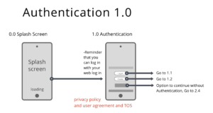
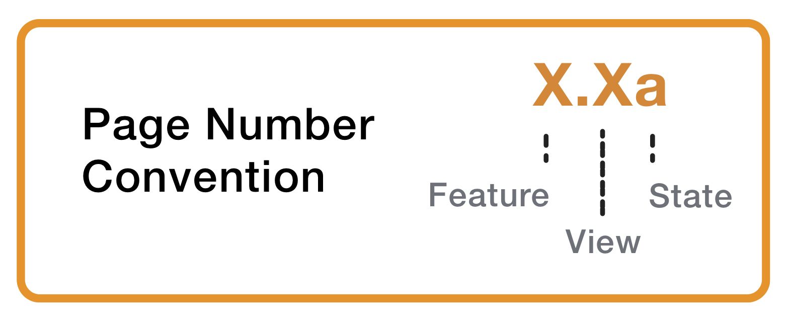
      3. Continuing through the login flow, we make screens for the input sections unfilled and filled, marking them as 1.1 Login and 1.1a Login Filled In to show that the filled state is a different view of the same state.
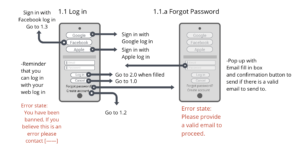
      4. Once you have that made, you can go ahead and make any additional screens that would be used in the authentication stage of the app before heading into the home screen of the app such as: notification preferences, location settings, or content suggestions.
      5. After you’ve completed the authentication feature, you can draw a vertical line and start laying out the next feature to the side of the line and repeat the process of making screens, filling them in with placeholders and drawing arrows to show where each input, text or button links to.
      6. Have another designer, if possible, review your work and make sure every screen has links to and from different screens and make sure that the flow makes sense.

When all your screens are accounted for, review your product map with a developer to test its functional viability and make any necessary changes to ensure your product can exist in the real world. Following these steps can help plan a well thought out product map for your team, users and clients to reference from when moving to designs and development.

Things To Consider

If your project consists of different user types, be sure to show a clear separation between them. If any features overlap, keep them in the same column but add a note to show the difference between user types. If no features or functionality overlaps, it’s best to separate them into two distinct product maps.

Summary

Now that you have your product map, you can use it to flesh out your product’s functional requirements and create your wireframes. Make sure to revisit it throughout the design phase as a reference and update as needed if any plans change.

Features and flows may change in the future once you start to refine what your final product will be, but having this base to start from will help differentiate what the specific features of your MVP will be.

Remember to focus on what will be in the product rather than how the functionality will work – you’ll be able to flesh that out later with the help of the feature requirements document and input from a developer.

If you liked this guide, check out some more articles!

Using Gamification in Mobile Applications

Introduction to Gamification In an era where mobile applications are an integral part of our daily lives, standing out in the crowded app marketplace has become a formidable challenge for developers. Gamification, the integration of game mechanics into non-game environments,

Read More »

To stay up to date on our workshops, follow OpenForge on Instagram, Twitter, and Youtube. 

The Mobile Academy

Discover how to build mobile apps on the modern web.

OpenForge was founded by software & design enthusiasts who believed that software should be created transparently, knowledge should be shared, and that by empowering others to succeed we ourselves succeed.

Receive access to our free guides and resources on building the world’s best mobile applications. Join free to The Mobile Academy

OpenForge App Image