How to use REM for Responsive Development

Table of Contents

How To use REM for responsive Design

How to use REM for Responsive Development

By Jedidiah Weller
Save yourself time, energy, and increase quality by using REM to make your application responsive.

Introduction to REM and Responsive Development


If you are a web developer, you know the importance of creating a truly responsive layout for your users.  Many developers attempt to utilize REM in their source code for responsiveness; but often combine it with a combination of pixels, percentages, and breakpoints for a hybrid approach that takes much of the architectural value out of fully-REM based implementations.

Rem (short for “root-em”) units dictate an element’s font size relative to the size of the root element. By default, most browsers use a font size value of 16px. So, if the root element is 16px, an element with the value 1rem will also equal 16px. Therefore, rem units are useful for scaling CSS elements in relation to the size of the root element — even if you don’t know what the default font size will be.

If this is you; fear not! In this guide we’ll show you how to create a responsive architecture pattern around a single declaration of font-size in your root document.  This will allow you to reduce code duplication and have more clarity in your development initiatives moving forward.

Here’s what we’ll cover:

      1. What is REM, and why is it important?
      2. How to set your root font-size
      3. How to convert your CSS Breakpoints to be responsive
      4. How to implement CSS linting standards to make sure you remove pixels from the equation.


    At the conclusion of this guide, we’re confident that you’ll not only understand REM; but also that you’ll be able to create more meaningful contributions to your team and your source code that will save time, money, and keep that hair on your head!

    1.  

    1.  

    What is REM and Why is it Important

    In this chapter we’ll be showing you why REM is important and why it’s considered a better approach to use REM from a root-level architectural perspective, than it is for responsive development.


    First off, let’s create some definitions. You can find a full description of units by W3, but to abbreviate:

    • “Rem” is short for ‘root-em’ and it’s units dictate an element’s font size relative (this is important!) to the size of the root element.
    • “Em” unit is simply the font-size.


    So to start out, in our application we need to set our font-size at the root level to 16px.


    html {
       /* If we change this using a responsive REM approach, it will modify the starting sizes of all implementations that use rem in our application */
       font-size: 16px;
    }

    This sets the root level font-size to 16px; which directly affects everything that uses REM.  So for instance, in our application if we set the following scss we would get the following results.


    ion-button {
       font-size: 1rem; // This is equal to 16px when it starts, i.e. 1x of root's font-size
    }
     
    ion-card-title {
       font-size: 1.2em; // This is equal to 19.2px when it starts, i.e. 1.2x of root's font-size
    }

    Most importantly, this allows us to scale our application not only based upon the scale of a window, but also the scale of that user’s font preference.  More on this later! 


    Now that we have our font-size responding directly to the root element; it’s time to adjust some of our padding and margins respectively.  One mistake we see often is this:


    ion-button {
       font-size: 1rem; // This is equal to 16px when it starts, i.e. 1x of root's font-size
       padding: 30px; // this is hard coded - might look good when font is 16px, but it would be overkill if the font was 10px, and underkill if it was 40px;
    }

    In this case, the padding would be insanely huge if the font-size decreases, and may break the responsiveness and formatting if it increases if there’s not enough space.  So instead, we can turn this into a ratio of padding to font-size.


    ion-button {
       font-size: 1rem;
       padding: 1.5rem; // In this example, the *ratio* of font to padding always stays the same
    }


    So you can see, using this approach can keep the ratio of our designs aligned which is great!  However, you may be saying to yourself OK the ratio stays the same – but the font-size doesn’t change to the device so how is this responsive?

    Great question 🙂  Let’s cover that in our next chapter!

    Using Breakpoints for Responsive REM Architecture


    Alright, so we understand now how we can keep the ratio of our designs consistent by setting our starting font-size, and then having styles like padding, margin, etc all relevant to the content inside the component. That’s great, but how do we make our entire application responsive using REM units?


    Well, the key to that lies in setting “Breakpoints” intelligently. Before we dive into why we said ‘intelligently’, let’s define what a breakpoint is and how they are typically used:

    A “Breakpoint” is a way to specify which CSS/SASS logic will be used for predetermined screen sizes. Once the screen-size (breakpoint) is hit, the styles under that breakpoint will take effect.

    Breakpoints were created to provide easy to understand ways to adapt CSS to different device sizes, and if you’re wondering the answer is yes, they work! However, while breakpoints can create responsive layouts they come with some serious drawbacks:

    • Breakpoints are not fully responsive – they rely on ‘ranges’ so you’re dealing with averages.
    • Breakpoints require code duplication (i.e., in the example below we declare mission-content twice)
    • Additional device sizes require additional breakpoints. (imagine a new phone size is added)
    • Breakpoints require more code, and more code equates to more maintenance.
    • As an example, let’s look at the following code snippet for a single component:

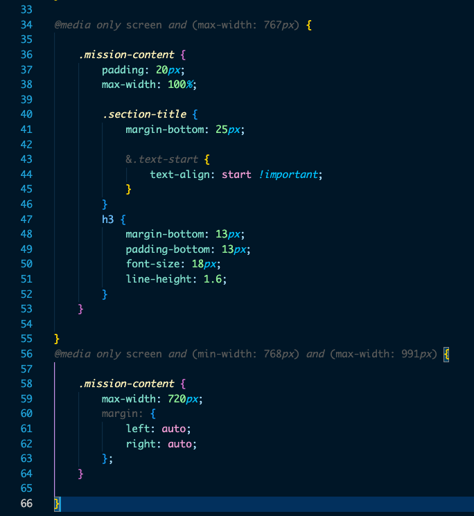
    In this example we have the following issues: 

    1. Padding is fixed at 20px, which means it does not act responsively from 1-766 pixels.  On a much smaller layout, the padding would likely appear too large.
    2. ‘Mission-content’ is declared twice, which breaks the rule of avoiding code duplication.
    3. For additional screen sizes, we have to declare additional breakpoints and additional code duplication which makes maintenance a nightmare. 
    4. This requires multiple breakpoints on every responsive component.  That’s a lot of code!

    So if you are building an app with 100 components, you’ll likely need to have 100 ‘.scss’ files that EACH have their own breakpoints using this approach.  That is a lot of duplicated code, and a lot of overkill!   Is there a simpler way?   Yes, most definitely 🙂 

    The simple answer is that we still need breakpoints; but if we use a REM focused architecture we can set our breakpoints only in one place – the root level.


    html {
       /* If we change this using a responsive REM approach, it will modify the starting sizes of all implementations that use rem in our application */
       font-size: 16px; // most browsers default to 16px;
    }
     
    /* Extra small devices (phones, 600px and down) */
    @media only screen and (max-width: 600px) {
     html {
       font-size: 14px;
     }
    }


    In this example, we can see that as the device size increases and decreases we are changing what our html font-size is.  This has a cascading effect on all the components that rely on REM; and if we setup all our components to maintain their ratio to the font-size then we’ll see a fully responsive layout.

    They will not scale to multiple device sizes, as can be seen very easily in this gif by designer Sandijs Ruluks.

    Designer Sandijs Ruluks explained responsive web design easily with gifs on his blog.


    Designer Sandijs Ruluks explained responsive web design easily with gifs on his blog.

    With REM however, you can instead set only a single set of breakpoints at the root level, and then from that root level have everything else respond accordingly.

    Converting Existing Code PX into REM


    If you made it this far then you understand the importance of REM, and you are dedicated to improving your code base and decreasing code duplication. We salute you for your valiant effort, dear web developer!


    So, let’s start getting into details for how you can convert your code to REM. The first step is to understand how Pixels can become REM units. Let’s look at the following example”

    PX units

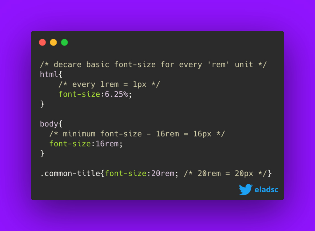
    1. First off, you will need to consider that 1 rem = 16 pixels.
    2. So in this case, we will need to divide the units of the design in pixels by 16.
    3. For example, a font that was 24 pixels in size becomes: 1.5 rem or 24 (px) /16 = 1.5 (rem)

    Another super easy way (and the easiest, honestly) to convert px to rem is simply to google “20px in rem”.  The calculation is done for you in that case which makes this an extremely short chapter.

    Testing Responsive REM

    Sometimes the best way to learn and work with new methods is by actually testing them.  To help you on this approach, we’ve created a tool to help you understand and play with responsive development using REM.  Take a look at the stackblitz below; and if you’d like to check out the repository please visit it at Github and don’t forget to give it a like!


    Here are a few key takeaways from this example:

    1. REM is responsive based, so if you change the font size on the parent (DOCUMENT), the REM will be responsive based on the font size of the parent.
    2. EM is similar to REM but instead of being responsive with DOCUMENT, is responsive based on the father element with a size declared. In this example, the header module uses EM.
    3. PX is the non-responsive unit. This should be set on the DOCUMENT level only.

    A great benefit of using this tool is that it will help you easily identify key characteristics within your product such as good scalability, component flexibility, overall behavior, and reading experience that will allow you to review your application’s compliance with mobile accessibility standards even from an early point in your development.


    Now that you’ve seen the tool in action, let’s quickly recap some of the benefits of implementing REM in your own projects.

    • Your team will easily be able to test how your product performs across different devices
    • You’ll be able to quickly spot any resizing issues before release to better optimize your product for your end users
    • Previewing your designs early on in the project will give your team a leg up in the implementation project


    You can always add this tool to your bookmarks! And share it with your colleagues that might find this useful. Creating digestible, visual examples can provide realistic insights to those members on your team who might not be as immersed into the reasoning behind coding and back end decisions, so by following an easy to understand approach you’ll be able to bring your entire team together. Failing to do so can result in draw backs and miscommunications, so make sure to align correctly and see the results of having everyone on board!

    Main Takeaways for Responsive Development

    Our final notes on Mobile Accessibility.


    Congratulations! You’ve now reached the end of this guide. By this point, you’re now able to identify the benefits of integrating REM units for creating a better responsive and accessible product, all whilst saving you valuable time, project budget and sanity – so what’s next?

    It is highly recommended that teams continuously talk about the constant implementation in the market of devices (and their respective accessibility features), since this might involve creating new guidelines to project processes before and after the development and QA phases in order to best work through viable outcomes together. Since not all solutions may be captured during design, this would potentially help cover 99% of use-cases.

    You might encounter information online that suggests working with Px, but keep in mind it is an absolute unit and can become unpredictable when sizing up or down designs for different devices. REM units, on the other hand, are useful in that they will allow for your product to be more responsive and accessible, particularly for users that want to customize their browser experience. Always feel free to use our Responsiveness tool from Chapter 5 to either review any product yourself or with your team.

    We hope that after reviewing this guide, you’re now more aware of the importance and benefits of using units that allow your product to comply better with mobile responsiveness. Rest assured that by using them, you’ll be able reach your product goals faster and smarter. Don’t forget to send us your results and thoughts after going through this particular method!


    Best of Luck,
    OpenForge team

    Additional Mobile App Guides
    Connect with us

    Are you enjoying our guides? Share your thoughts and let us know what you would like us to write about next!