

These days, mobile application design means a lot of things. UX designers are tasked with creating wireframes, mockups, and prototypes to define not only the look and feel of the app (layout, color scheme, typography, iconography), but the structure and intended functionality (navigation and flow) as well. But that’s not all – as a UX designer you could also be tasked with conducting user research, designing an app icon, creating custom assets, defining interactions, communicating with developers and stakeholders, and more. That’s a lot to keep track of!
It may sound like a lot, but more and more software companies are realizing that it’s worth the effort. A study conducted by Forrester Research found that investing in mobile application design can yield a return of up to 9,900%. According to the report, companies that prioritized UX design had reduced customer acquisition costs, increased customer retention, and captured a higher market share. In a study of 15 publicly traded US companies, the Design Management Institute found that design-driven companies outperformed the S&P Index by 211% over a ten-year period.
Investing in user experience can lead to
- Increased customer satisfaction – By understanding what your users need and want, you’ll be better prepared to deliver them experiences that meet their expectations
- Improved customer retention – When users have positive experiences, they’re more likely to stick around – and recommend your product to others.
- Enhanced brand reputation – A positive experience with your product will in turn lead to an overall increase in appreciation for your brand.
- Increased Revenue – As we noted above, investing in UX can pay dividends! It’s a financially sound decision to focus on design when developing software products as it can lead to an increase in revenue from ads, sales, and other funnels for revenue.
- Define the problem – In order to inform your decisions, you should first start by conducting market research, learning about your target audience, and identifying pain points. Are there any existing products on the market, and what are they doing to address those pain points? We also recommend completing a LEAN canvas exercise with your client or stakeholders to understand their expectations for the application.

- Conduct user research – Now that you have identified your target audience, it’s time to learn more about them. You can do this by creating surveys, interviewing prospective users, and conducting usability testing.
- Develop user personas – With the information you’ve gathered from your user research, develop a user persona to define the user’s wants, needs, and preferences, and give a human face to the user. Check out our free wireframing kit which includes a user persona template for you to modify!
Before you rush out and start designing your product, it’s important to understand how to design a product that is accessible and to review accessibility guidelines. If you are publishing to the App Store, this is especially important as a product can and will get rejected for not complying with Apple Accessibility Guidelines. If you’re not already familiar with web accessibility standards, read on to find some helpful links to get you started.
What is Accessible Design?
Accessibility in design means designing in such a way that considers the range of abilities of all users. It focuses on the outcome or end result of a design project. This means making sure that your color palette has sufficient contrast, is compatible with screen readers, has sufficient text size, and more. It’s based on accessibility guidelines published by various governmental and industry groups.
You can review Apple’s Accessibility guidelines here, and for a comprehensive breakdown of all accessibility standards, download this free WCAG checklist by LevelAccess.

There are a number of design and prototyping tools on the market that will allow you to create and maintain design systems and build out prototypes. Here are some popular options:

1. Sketch: Sketch is a popular vector graphics editor that is used by many product teams for mobile app design. It provides a host of features and plugins for creating wireframes, prototypes, and high-fidelity designs.
2. Adobe XD: Adobe XD is a user experience design tool that allows designers to create wireframes, prototypes, and high-fidelity designs. It’s design and collaboration tools make it easy to create and share designs among team members and other key players.
3. Figma: Figma is a cloud-based design software that helps designers collaborate on designs in real-time. It has recently introduced version control, making it even easier to collaborate and maintain version control. With design, prototyping, and version control all in one place, the product has seen significant growth and increased market share over the past few years. Figma has also been in the news recently due to its pricey acquisition by Adobe – keep an eye out on developments for this software as it takes on new leadership.
4. InVision: InVision is a design and prototyping tool that allows designers to create interactive prototypes and animations. One of the earlier prototyping tools to hit the market, it has recently lost market share to prototyping giants like Sketch and Figma, but still remains a popular choice among many design teams.
5. Marvel: Marvel is a prototyping tool that allows designers to create interactive prototypes for mobile apps. It is compatible with Sketch, providing the ability to sync designs from sketch to prototype.
Be sure to test out any products you’re considering before committing to one. Each product has its pros and cons, and you’ll have to determine for yourself which one is best suited to your particular needs.
What is a Product Map?
A product map is a way to visually represent every feature and screen of your product in one view. In a product map, each screen should be represented as a low fidelity wireframe and organized according to the feature where it would be found.
Why create a Product Map?
A product map will allow you to “map out” each page of your product and understand how the user will navigate through each feature. By completing it, you will be able to:
- Name and identify each feature and screen in your product – We use a naming convention that allows us to organize features numerically and serve as a reference point for where you are in the application. Each feature is given a numerical designation, and each page begins with the number (X) that corresponds to its feature. The second number, or x, corresponds to where you are within the flow. The first page, or landing page, in any flow, would have a ‘0’ in its second position. The letter in the third position, or a, corresponds to the data state, which is conditional. The default state of any page would not have a letter in its third position.

As an example, an application could have a page called “3.0 Profile” and “3.0a Profile – edit” to show that profile edit mode is another version of 3.0 Profile. In other words, the overall layout remains the same, but the data state has changed.
Check out our wireframe kit for a full list of guidelines for how to set up your product map.
- Understand the number of screens that will need to be designed and developed – By identifying each known screen, you will be able to generate a scope for the amount of work the project will require. This will be crucial to planning and setting milestones.
- Align with developers and key stakeholders before beginning the design phase – Another important benefit of the Product Map is to make sure everyone is on the same page regarding the number of features and what it will take to design and develop them. As design is an iterative process, the exact number of pages may evolve over the course of the project, but it will allow you to agree on a starting point. Your development team can begin creating the skeleton for the app while designs are underway.
It’s recommended when designing a mobile application from scratch that you base your designs on an existing design system. The reasons for this are twofold:
- Don’t reinvent the wheel – While the interfaces we interact with in our daily lives may seem simple, user interface design is complex and nuanced. There are many possible elements and outcomes to consider. For this reason, we recommend starting with a proven framework that can then be refined and customized according to your project’s needs.
- Give your developers a break – Just as designing a fully custom design system starting from nothing would be time consuming, so would developing it. Starting from an existing framework can save significant time and development costs because your developers will be able to work from an existing codebase, and tweak it according to your design specifications.
As for what design system to use, you’ll have to do some research to determine what system is right for your project. For instance, are you designing for iOS or Android, or both? Will your app need to be dark mode compatible? Are there any sensitivities you’re aware of that are common among your target demographic? The system you choose will need to take these considerations into account.
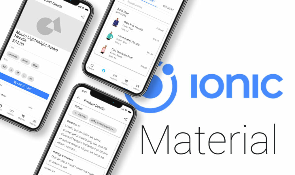
We recommend using the Ionic design system since it is adaptable both to iOS and Android, contains a wealth of different components and layout suggestions, and comes with extensive documentation. This will be incredibly helpful to your development team in terms of understanding how each component should work.
To create a style guide is fundamental. The style guide is an important reference point as it will define the color scheme, typography, iconography, and overall look and feel of your product. You should also consider adding any key elements such as buttons, cards, and navigation elements.
A style guide for a mobile application should contain:
- A color palette – Your color palette should be based on what you know about your target audience and the colors they are drawn to. There are many online tools that will help you put together a palette. Some of our favorites are Adobe Colors, Coolors, and Muzli. You’ll also need to consider color accessibility. Your colors will need to meet a certain contrast threshold to be considered accessible. You can test the contrast on any two colors here. If you’re using Adobe Colors, you can even use their built in contrast checker without leaving the site!

- Typography styles – You’ll need to define all the styles that will be used throughout the application. Start by coming up with a type pairing. You may want to use one typeface for headings for instance, and another for paragraph or body copy. We recommend trying out a few different type pairings and experimenting with them. You will also want to make sure the typefaces you choose are web-friendly. We recommend exploring options on Google Fonts to ensure compatibility. For more best practices and things to consider when creating a typography system, check out Apple’s Human Interface Guidelines for typography. Stuck on which fonts to pair together? Head over to Fontpair to get some ideas for google font pairings.
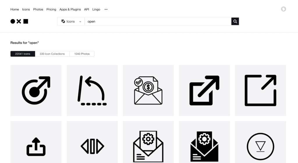
- Iconography – Iconography is a key part of many digital products, and can go a long way as far as defining the look and feel of your product. If you’re working with an existing design system like Ionic, it may come with an icon library to get you started. Even better – Ionic’s entire icon library is 100% open source. However, your product may call for custom icons as well. Make sure any custom icons match the style of any icon library you’re already using for consistency. If you’re struggling to decide what type of icon would best represent what you want the user to understand, try The Noun Project. You can search their library of over 5 million icons and find what images come to mind most frequently for any given search term. It’s useful in understanding what people will ‘see’ when they look at your icon.
The most effective icons are simple and able to be understood by any person regardless of language or background. Even so, it’s difficult to ensure that 100% of your audience will interpret the exact same meaning from a given icon. For this reason, it’s recommended to include small text labels alongside icons to define them. This will also allow your designs to be friendlier to screen readers.
- Key components such as buttons, cards, and form elements
Use the design system you’ve selected to form the basis of any key elements like buttons, card, and inputs. You can modify these elements according to the branding needs of your particular project. Just make sure that the modifications you apply are consistent throughout your design system.
So now that you understand the problem, reviewed accessibility guidelines, created a product map, and defined key elements of your design system, it’s time to build your prototype! The prototype will be the final proof of concept that will be handed to developers along with assets and visual specifications for your designs.
Working from your product map as a reference point, build out each screen according to the specifications of the design system. Make sure to make all your elements reusable, including fonts and components, so your designs can stay consistent as they evolve.
1. Keep it simple: When you’re designing for a mobile app, your screen size is limited, so the design should be simple and easy to navigate. Avoid unnecessary elements and make sure your language is clear and to the point.
2. Use intuitive navigation: Make sure your navigation is uncomplicated and intuitive so users can easily find their way around. You may want to use icons with labels instead of just text to define the navigation and make for a more aesthetically pleasing layout.

3. Design for touch: Since mobile devices are primarily touch-based, you will need to design for touch interactions. Make your buttons large and ensure that there is sufficient space between them to avoid accidental taps.
4. Use consistent branding: Using consistent branding throughout the app will help to reinforce the brand identity and make for a more cohesive user experience.
5. Optimize for performance: Mobile users expect lightning fast load times and uninterrupted performance. Keep image and animation file sizes to a minimum to avoid loading delays.
6. Ensure accessibility: Use your knowledge of accessibility guidelines to make your designs accessible to all users. Ensure proper color contrast and compatibility with screen readers.
7. Test and iterate: Conduct usability testing and collect feedback from users to find out about any key issues or areas for improvement. Use the feedback to iterate and refine the design to ensure that it meets users’ needs and expectations.
8. Stay informed with current design trends: Mobile app design evolves rapidly, so it’s necessary as a designer to stay up-to-date with the latest design trends and best practices. You’ll also want to be on the lookout for new technologies and design tools that can help to improve the design process.
9. Consider platform-specific design: Different mobile platforms have different design guidelines and user expectations. You will need to review the guidelines for each platform your app will eventually be published on to ensure compliance with its standards.
To create a successful mobile design, we recommend a user-centered approach that focuses on simplicity, intuitive user experience, and visual appeal that is suited to the needs and preferences of the target audience. Remember that because mobile app design is an intuitive process, there can always be room for improvement! Start small and create a solid foundation with which to help your app grow and evolve over time.

Congratulations! You’ve now reached the end of this guide. By this point, you should have a better understanding of how to get started on mobile application design. Throughout the design process, it’s recommended that you communicate with your development team to align on expectations, and keep your client or other important stakeholders informed along the way. Since you’ll need cooperation from all involved parties, it’s necessary to have a clear understanding of the project’s timeline and maintain clear and consistent communication throughout the process.
You might feel overwhelmed at times, but remember to take it one step at a time, and always consider the problem from the user’s perspective as much as you can. Feel free to reference our guide at any time along the process – and reach out if you have any questions about how to apply this process to your existing project.
We hope that after reviewing this guide, you’re now more aware of the importance and benefits of investing in UX design and mobile design in general. Rest assured that by using this guide, you’ll be able to reach your design goals faster and more effectively. Don’t forget to send us your results and thoughts after going through this process!
Best of Luck,
The OpenForge Team