
To create a style guide is fundamental. The style guide is an important reference point as it will define the color scheme, typography, iconography, and overall look and feel of your product. You should also consider adding any key elements such as buttons, cards, and navigation elements.
A style guide for a mobile application should contain:
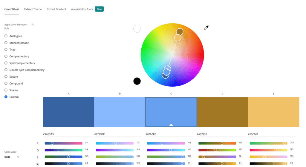
- A color palette – Your color palette should be based on what you know about your target audience and the colors they are drawn to. There are many online tools that will help you put together a palette. Some of our favorites are Adobe Colors, Coolors, and Muzli. You’ll also need to consider color accessibility. Your colors will need to meet a certain contrast threshold to be considered accessible. You can test the contrast on any two colors here. If you’re using Adobe Colors, you can even use their built in contrast checker without leaving the site!
- Typography styles – You’ll need to define all the styles that will be used throughout the application. Start by coming up with a type pairing. You may want to use one typeface for headings for instance, and another for paragraph or body copy. We recommend trying out a few different type pairings and experimenting with them. You will also want to make sure the typefaces you choose are web-friendly. We recommend exploring options on Google Fonts to ensure compatibility. For more best practices and things to consider when creating a typography system, check out Apple’s Human Interface Guidelines for typography. Stuck on which fonts to pair together? Head over to Fontpair to get some ideas for google font pairings.
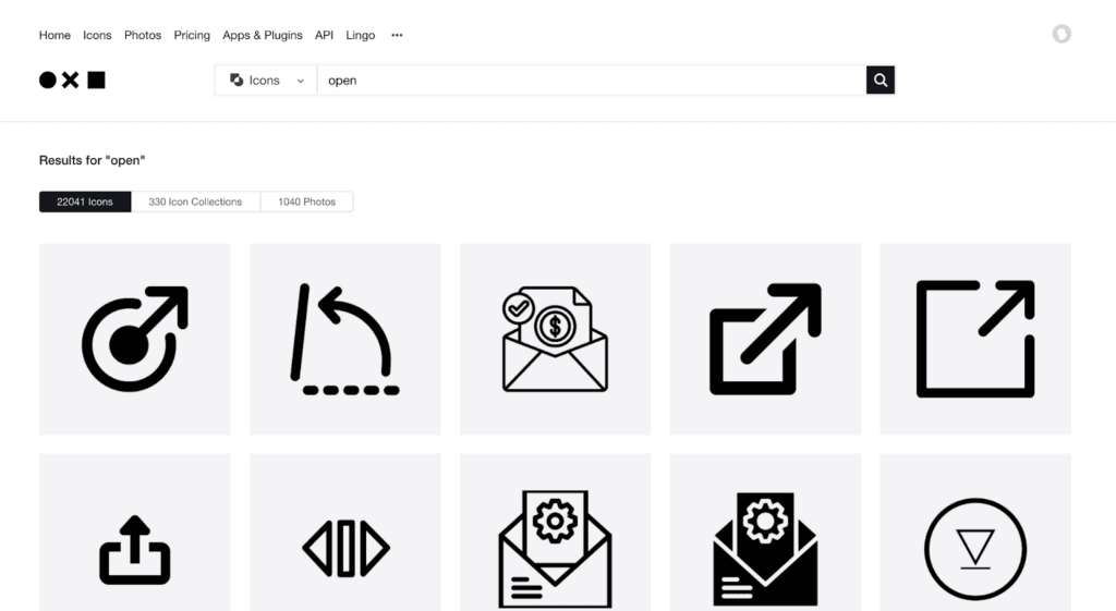
- Iconography – Iconography is a key part of many digital products, and can go a long way as far as defining the look and feel of your product. If you’re working with an existing design system like Ionic, it may come with an icon library to get you started. Even better – Ionic’s entire icon library is 100% open source. However, your product may call for custom icons as well. Make sure any custom icons match the style of any icon library you’re already using for consistency. If you’re struggling to decide what type of icon would best represent what you want the user to understand, try The Noun Project. You can search their library of over 5 million icons and find what images come to mind most frequently for any given search term. It’s useful in understanding what people will ‘see’ when they look at your icon.
The most effective icons are simple and able to be understood by any person regardless of language or background. Even so, it’s difficult to ensure that 100% of your audience will interpret the exact same meaning from a given icon. For this reason, it’s recommended to include small text labels alongside icons to define them. This will also allow your designs to be friendlier to screen readers.
- Key components such as buttons, cards, and form elements
Use the design system you’ve selected to form the basis of any key elements like buttons, card, and inputs. You can modify these elements according to the branding needs of your particular project. Just make sure that the modifications you apply are consistent throughout your design system.