
If you’re a UI/UX designer in the mobile application space, you have an important role to play when it comes to accessibility standards. While many focus on the functional side of accessibility, the visual component can be considered just as (if not more) important to users. After all, most people will remember their first impression of your company and your product.
First, let us explicitly state that the configuration of your project matters. Working with a monorepo is only beneficial if it is organized in such a way that supports your development cycle. While technically feasible, it would not make much sense to create a repository and add multiple projects hoping that it will make things better. At that point, one might as well go back to using multi-repos. That being said, it is important to consider how to best set up your monorepo depending on the tools you are using.
In our case, we want to leverage Angular’s support for multi-project workspaces so that we can have multiple Angular applications under one global configuration. Moreover, we want to use Ionic’s powerful CLI to run commands and add integrations such as Capacitor from anywhere in the monorepo.
In this guide, we’ll explain the importance of accessibility and show you how to implement mobile accessibility standards while maintaining the visual appeal of your application.
What is Accessibility?
Accessibility is measured by three levels: Single A is the least comprehensive, AA is more comprehensive, and AAA is the most comprehensive and thus the most accessible based on the guidelines set by Web Content Accessibility Guidelines (WCAG). The full list of guidelines can be found here. If you’re new to accessibility, we recommend starting with Single A and creating a plan to work toward greater accessibility rather than trying to implement everything at once.
Once we are done with our Light theme, we might need to know some things before we go to define our Dark Mode. In CSS we can use the media decorator to know if our user has requested the system to use Dark color theme simply as adding this:
Why is Accessibility Important?
As a user experience designer, the success of your product relies on ease of use. Although the WCAG standards were developed in compliance with the Americans with Disabilities Act (ADA), designing with accessibility in mind will widen the audience and reach of your product, positioning it for greater success in an extremely saturated market. Think of it this way: a product that is not accessible will be annoying to use at best and impossible to use at worst. For that reason, accessibility is key to your product’s success.
Step 1: Creating an Accessible Color Palette
There are plenty of tools out there for creating color palettes, but not many that account for accessibility. If you have an existing color palette, you should first test for visibility with a contrast analyzer like this one. If you’re starting from scratch, Adobe Color is a great way to make sure your hex codes are easily legible even for the visually impaired.
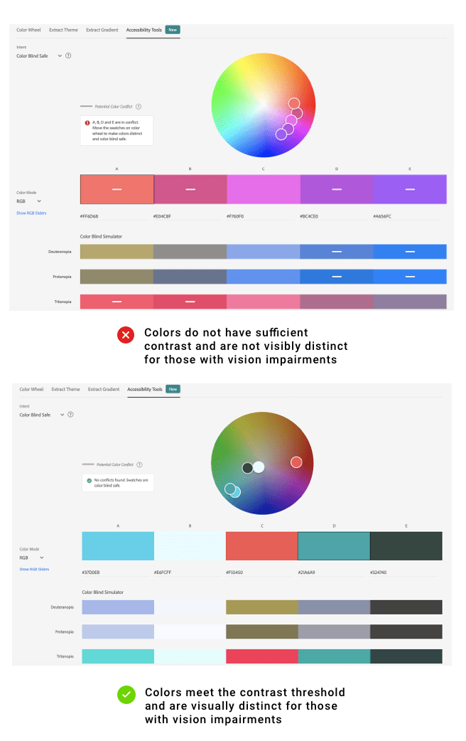
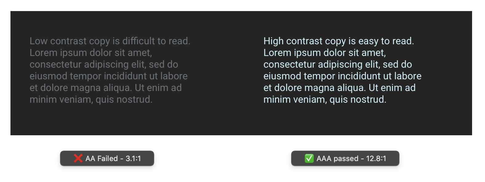
Pro Tip: Make sure you provide enough contrast between background and foreground elements, including text, images with text, background gradients, buttons, and other elements.
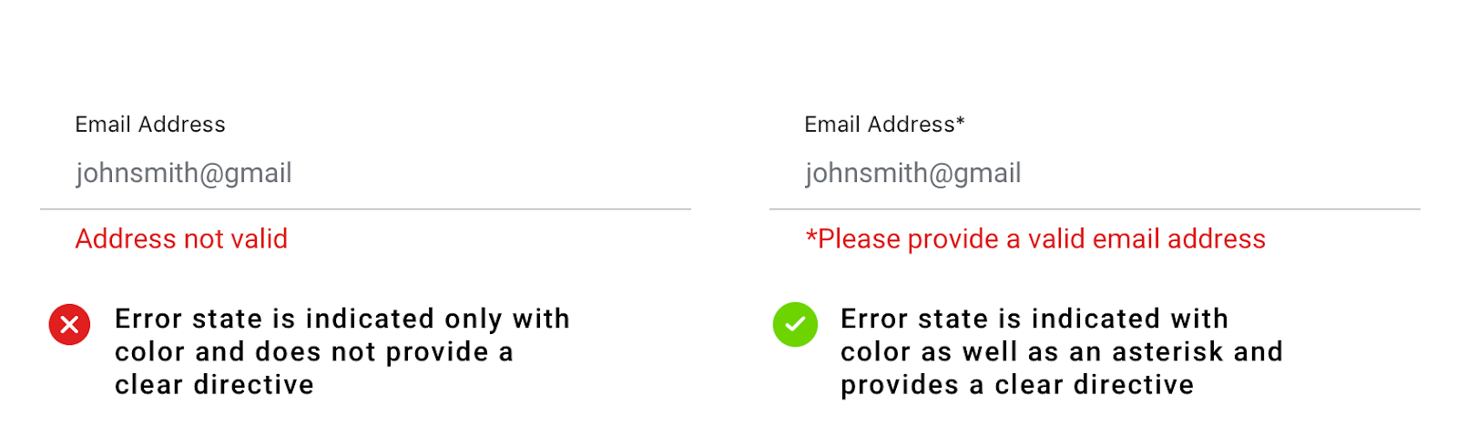
Pro Tip: When conveying information, don’t rely solely on color. While color can help to emphasize a point, it’s necessary to provide more context for users who may have vision impairments.
Maintaining Visual Appeal with Color:
- Avoid using too many colors in your interface as this may confuse and overwhelm the user.
- Aim for 5 colors or less for maximum appeal and ease of use.
- Understanding color psychology will come in handy as you’re putting your color scheme together.
- Different colors will symbolize various concepts, feelings, and ideas that vary by culture.
- Being aware of people’s preconceived notions about color will help you select swatches that will appeal to your user base.
Step 2: Creating Accessible Text Styles
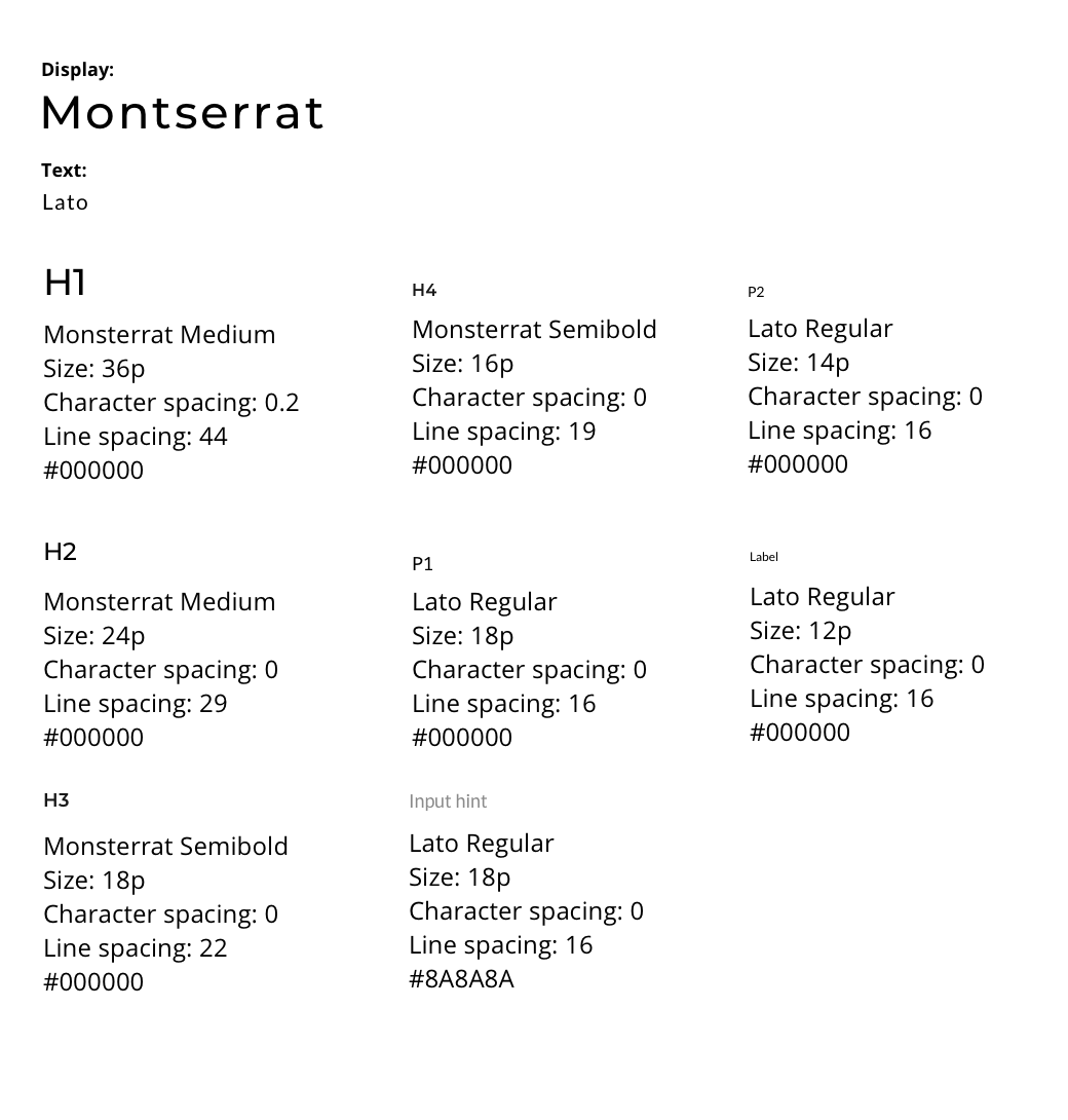
When it comes to UX design, typography needs to serve a specific purpose. Remember that every element of your design will signal something to the user, and text is no different. The user won’t just be reading what is displayed, but how it’s displayed. For this reason, your text styles should follow a logical order of hierarchy, with the most prominent messaging being the largest, and descending in size for secondary and tertiary messaging.
- Visibility is key: Start with web-friendly fonts that have high visibility. We recommend exploring typefaces on fonts.google.com as they have been validated for web-accessibility.
- Less is more: As a general rule of thumb, avoid having more than two font families as part of your design system. Too many typefaces will weigh down your app and leave the interface looking cluttered and disorganized.
- Establish a hierarchy: Designate one typeface as a display font to be used in headings and one typeface to be used for body copy and labels.
Check your sizing: Make sure your smallest text style is still legible – anything less than 12pt can be difficult to read. - Maintain visual appeal by defining your styles: Add each style to your library or document to keep track of them and to ensure that all text adheres to the defined system.
Below is an example of what your typography system might look like. It’s best to keep these styles organized in a style guide in your document or library along with colors and other important design elements such as buttons, icons, and major components.
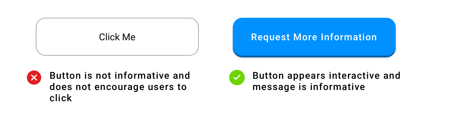
Step 3: Guide the User with Language and Style Cues
If you expect a user to interact with an element, make that apparent.
- Style elements like buttons and links so that they stand out from static elements and follow a consistent pattern throughout the application.
- Make sure the message within the button or link contains clear direction to let the user know what’s happening.
- If your app contains iconography, make sure each icon is clearly visible from a small size. Icons may appear as small as 20 pixels depending on the device viewport size, so check to make sure each icon is legible even from the smallest device.
- Include labels to define icons wherever possible.
- Provide feedback to the user to validate their actions in the form of toast messages, error messages, and micro-interactions to let them know what’s happening
- Make sure any graphic elements reinforce the messaging or directives given rather than distract from it.
Maintain visual appeal with cohesion: If a user is presented with too many options, they may feel overwhelmed. Applications with low visual complexity tend to be more appealing to users because the barrier for understanding is lower.
Step 4: Keep It Consistent
Just like in a building, we rely on patterns in digital applications to tell us where we are. Make sure the user has the necessary context to understand how to navigate the application.
- Make sure each page of your application has a header with a page title, while each sub page should have a back button or another way (such as a close button) to get back to the main page.
- Add each header component to your style guide as a symbol and compare to ensure each follows a consistent pattern, checking for positioning, text styling, and navigation elements such as a back button
Maintain visual appeal by creating consistency across devices: Think about the experience from mobile to tablet and make sure that important interactions remain the same across platforms. A consistent experience will reassure the user and will increase your application’s visual appeal.
Step 5: Make It Responsive
Remember that there are many different devices with which a user can access your product. Knowing which devices your product will be available on can help you to determine how responsive your designs will be.
- Mobile first: Design for the smallest device port size first so that you can scale up content rather than needing to scale down
- Consider the orientation: are your users more likely to experience the app in landscape or portrait mode? Make sure to account for either scenario by testing designs in both orientations.
- Make sure elements such as buttons and navigation elements are easily reachable for both left handed and right handed users
- Avoid using elements such as sliders or scrolling carousels if they require specific responses as this may be difficult for users with dexterity issues
- Think about the experience from mobile to tablet and make sure that important interactions remain the same across platforms. A consistent experience will reassure the user and will increase your application’s visual appeal.
Maintain visual appeal by creating consistency across devices: Think about the experience from mobile to tablet and make sure that important interactions remain the same across platforms. A consistent experience will reassure the user and will increase your application’s visual appeal.
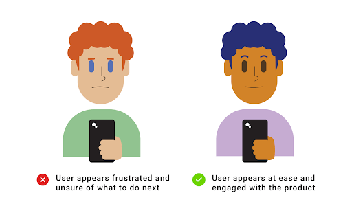
Step 6: Validate Your Assumptions
To validate your assumptions, you’ll need to test your designs on actual humans.
- First, upload your designs into a prototyping tool. Popular programs include Figma, InDesign, and Invision.
- Click through it yourself to make sure everything is where it should be, then recruit some volunteers (the more the better!) to test your designs.
- If possible, observe and record their reactions to each page. This can be done either in person or remotely via a teleconferencing software such as zoom or hangouts. What does their facial expression and body language tell you? How long do they take to make a decision? Did they get stuck anywhere? The answers to these questions will give you insight into how accessible your product is.
- If your test subjects seemed confused or hesitant, review your designs against your notes for any weak points in the user flow or elements that could be improved for greater clarity, then repeat the test to compare results.
Final Thoughts
As designers, we have a responsibility to create products that can be enjoyed by anyone. While the task of adhering to accessibility standards might seem overwhelming, focusing on one aspect at a time will allow you to design beautiful and accessible applications no matter who your user base is. And if you follow this guide, you’ll have the framework you need for success. I hope you’ve found this information helpful, and please feel free to get in touch if you have any questions!
Don’t stop now, keep on learning!
Gamification Strategies for Enterprise Applications
In today’s digital playground, where mobile apps vie for attention on every smartphone, breaking through the noise is tougher than ever. Enter gamification—a dynamic approach
For more guidance on Mobile Design and User Experience, follow OpenForge on Instagram, Twitter, and Youtube.

