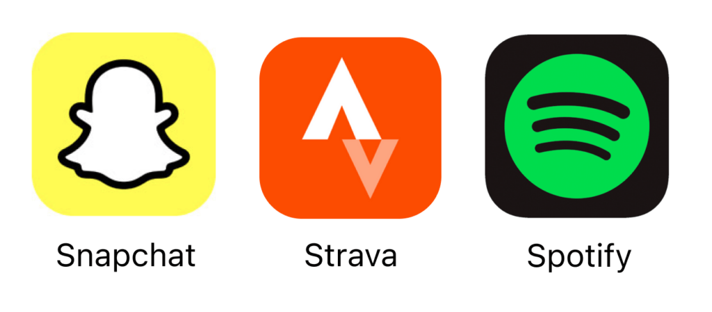
A picture is worth a thousand words, and when the only image you have to make an impression with is a ~100 square pixel app icon, it may be worth even more. When users search for apps in the store, they only see the small icon alongside the title and a brief one line description. This is why you should learn to design an effective icon!

This little icon will make a big difference as far as how your app will be perceived by potential users, so you’ll want to make sure that it is an effective and accurate representation of your product. Here are some qualities of a well-designed app icon you should keep in mind to design an effective icon:
- Simplicity. The icon will primarily need to be viewed at a very small scale, so make sure that even at a small size it is recognizable and doesn’t have any overly complicated details.
- Uniqueness. Just like a logomark, an app icon should be distinguishable and unique. Make sure people won’t be able to easily mistake it for another app. You’ll want to research other competing apps on the market to make sure your icon does not look too similar in color or form.
- Versatility. Just as the icon will need to scale down, it will likely need to scale up as well for branding or other types of icon placements.
- Eye-Catching Color. Color is one of the first pieces of information that registers when we look at something, so make sure the color you choose is pleasing to the eye and stands out against similar apps.
- Strong Branding. An app icon is a facet of your product’s overall branding, so make sure the icon is consistent with your brand’s logo and other elements that contribute to the overall look and feel.


